

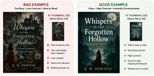
When readers browse online bookstores—especially on their cell phones—they don’t meet your book at full size. They meet it as a thumbnail — a tiny postage‑stamp version of your cover squeezed between dozens of others. That first impression matters more than most authors realize. A beautiful full-size cover can fall completely flat when reduced to thumbnail size, while a simple, well-structured design can suddenly shine.
If you want your book to stand out in crowded digital storefronts, your cover has to work at both large and small sizes. Here’s how to evaluate your book’s front cover as a thumbnail — and what to fix if it’s not pulling its weight.
Why Thumbnails Matter More Than You Think
Most readers discover books through:
- Amazon category pages
- “Customers also bought” carousels
- Search results
- Social media posts
- Book review roundups
- Mobile screens (where thumbnails are even smaller)
In all of these places, your cover is competing for attention in a grid of tiny images. If your thumbnail doesn’t communicate genre, tone, and professionalism instantly, readers scroll right past.
A thumbnail doesn’t need to tell the whole story — it just needs to spark enough interest to earn a click.
The Three-Second Thumbnail Test
Here’s a quick way to judge your cover’s thumbnail strength:
1. Shrink your cover to about 150 px (pixels) tall.
2. Step back from your screen or view it on your phone.
3. Ask yourself three questions:
- Can I read the title?
- Can I tell what kind of book it is?
- Does anything visually stand out?
If the answer to any of these is “not really,” your cover needs work.
Common Thumbnail Problems (and How to Fix Them)
1. The Title Disappears – Thin fonts, low contrast, or overly long titles often vanish at small sizes.
Fix: Choose a bold, high-contrast typeface and simplify your title layout. If your subtitle is long, consider reducing its size or moving it to the back cover.
2. The Artwork Turns to Mush – Highly detailed illustrations, busy photo collages, or layered textures can lose clarity or blur into a single indistinct shape.
Fix: Use a strong focal point. Simplify background textures. Increase contrast around the main subject.
3. The Genre Isn’t Obvious – Readers rely on visual cues — color palettes, typography, imagery — to instantly understand what kind of book they’re looking at.
Fix: Study top-selling covers in your genre. Look for recurring visual cues: serif fonts are common in historical fiction, bold sans-serifs often appear on thrillers, pastel palettes frequently signal cozy romance, and so on.
Not sure what visual cues readers expect? Our earlier article, The Essentials Every Author Should Know About Book Covers, looks more closely at the fundamentals of effective cover design.
4. The Layout Is Too Delicate – Fine lines, thin borders, and subtle gradients often disappear entirely.
Fix: Strengthen shapes, thicken strokes, and avoid design elements that rely on tiny details.
5. Everything Is Fighting for Attention – If the title, subtitle, author name, series name, and artwork all demand equal attention, nothing becomes the focal point.
Fix: Establish a clear visual hierarchy. For most self-publishing authors, the title and primary image should do the heavy lifting. The subtitle, author name, series name, and other supporting elements should complement the design—not compete with it.
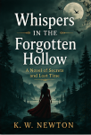
Here are some examples to see how these principles play out. Both covers use the same title and author name, but one fails at thumbnail size while the other succeeds.
 |  |  |  |
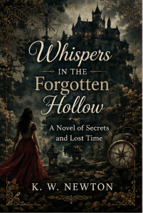 |  | 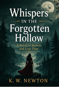 |  |
Note: These are nonexistent books by K. W. Newton. The covers are AI-generated mockups created for demonstration purposes only. I don’t design book covers; these examples simply illustrate how a design can succeed—or fail—at thumbnail size.
What a Strong Thumbnail Does Well
A great thumbnail usually has:
- A clear, readable title (even if the subtitle drops out)
- One dominant visual element
- High contrast between text and background
- A color palette that signals genre
- A layout that still feels balanced when tiny
Think of your thumbnail as a miniature billboard. It must communicate instantly.
Try the Squint Test
Shrink your cover, then literally squint at it.
If you can still identify the title and main image, your visual hierarchy is strong. If everything blends together, you need more contrast or simpler shapes.
Thumbnail-Friendly Design Starts Early
Thumbnail clarity shouldn’t be an afterthought. When planning your cover:
- Choose a focal point that remains recognizable at small sizes.
- Select typography that holds up when reduced.
- Avoid overly complex designs.
- Test early and often — thumbnails reveal weaknesses quickly.
If you’re working with a designer, ask them to show you the cover at multiple scales, including a thumbnail-sized version—around 150 pixels tall—to see how the design holds up at a realistic small scale.
Your Thumbnail Is Your First Impression
A thumbnail isn’t just a smaller version of your cover — it’s a marketing tool. It’s the handshake, the storefront window, the moment a reader decides whether to click or scroll past.
Take the time to evaluate yours honestly. A few thoughtful adjustments can make the difference between a cover that disappears in the crowd and one that earns a closer look.
This article was developed with the assistance of AI and reviewed, edited, and expanded by BookLayoutPro.